Devourer
Fight to become scourge of the universe and be the first to ascend to godhood by devouring the Bright Heart of The Universe! Never mind that there'll be nothing left to be god of afterwards...
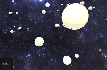
Devourer is a turn-based, top down....simulation(?) game where you race others to be the biggest and baddest thing in the universe. You're basically the Very Hungry Caterpillar, but on a galactic scale.
Created in two days for EpicGamer3's Space Jam. Spent way too long on the AI, to the detriment of every other system.
Music by the amazingly talented Andrew Sitkov.
Star Nest Skybox by the illustrious Ninjapretzel.
Instructions:
Objective:
The objective of Devourer is to grow in Power until you can consume the center of the universe, becoming indomitably large and powerful. There are other devourers doing the same thing, so you need to be the first!
Turns:
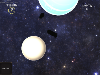
Devourer is turn based. At the start of your turn, you gain an amount of Energy equal to your current Health, up to a maximum of your Power. You use this Energy during your turn to take actions such as moving, absorbing power from planets, and defending yourself.
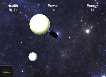
At the end of your turn (which you trigger by pressing the button in the lower left corner), you take an amount of damage equal to your current Harassment, which is shown in parenthesis next to your health. During your turn, click on your character to spend energy to remove harassment and heal.
If you die, you are sent back to the point you started at and your Power is cut in half. Try to avoid it!
Controls:
Clicks:
- On self: Remove harassment or heal. Requires Energy.
- On Planet: Move to planet if out of range, Devour if in range. Requires Energy.
- On Space: Move. Requires Energy (shown above the cursor object).
- On Other Player: Fight! Expend your energy to deal an equal amount of damage to another devourer in range.
- Right Click on Any: Do the maximum number of actions possible with the given stats and Energy.
Hovers:
- On Player: Show current power, energy, and health.
- On Planet: Show Energy needed to Devour, number of Devours remaining, and how much Harassment you get for each Devour you do against it.
- Over Cursor: The labels above the movement cursor shows the distance to the hovered location or object and how much Energy you need to move there.
| Status | Released |
| Platforms | HTML5 |
| Author | User44226677 |
| Genre | Simulation |
| Made with | Unity |
| Tags | Mouse only, Point & Click, Sci-fi, Top-Down, Turn-based, Unity |
| Average session | A few minutes |
| Inputs | Mouse |
Download
Install instructions
Extract zip file and run application.
Development log
- Version 1.2a - UI UpdatesApr 04, 2021
- Version 1.2Apr 03, 2021
- Version 1.1Apr 03, 2021


Comments
Log in with itch.io to leave a comment.
the health concept is very confusing
no matter how much i tried to devour, i keep losing health every turn without make a move after first planet while cpu manage to keep increasing health easily
Thanks for the feedback! I added a bit to the instructions on the page to cover that mechanic - when devouring, planets defend themselves with a per-turn damage debuff. Spend energy on yourself to remove this debuff, and once it's gone you can spend energy to heal yourself.
okay that help a ton
is there be chance for map or hint for nearby planet or devourer?
required energy to pinpoint is little more misleading. from one planet to other planet cost 40 energy, result would be double or most of energy
little suggest: different color for my devourer or make it easier to select myself, i accident move and wasted energy when i want to heal myself
also my devourer do overlap planet to devour so it become harder to not only heal myself but finding planet to click devour
A map or UI element would be a great idea, I'll add that in. The energy to move goes up as a proportion of your power, keeps you from being able to move across the whole map in one go later on. The obscuring and selection problems when you get bigger are definitely an issue, and somewhat a product of the jam-game nature of the design. Different colors for other devourers is a good idea and should be easy to implement.
During the jam, I attempted to avoid having too many on-screen elements and keep things as one-buttonable as possible, but the scope definitely grew out of the realm where that is convenient to do. For the next pass, here's what I'm thinking:
Thanks again for playing and the feedback, I can't express how much it is appreciated!
np
gl :D